Foodfly
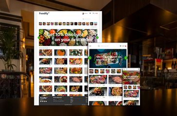
Food ordering / delivery responsive website with drones.
UX Case Study
Project overview
The product:
Foodfly is a food ordering and delivery website but instead of a car or motorcycle, food will be delivered with drones. Fast & precisely on time.
Project duration:
Juny 2022 to September 2022
The problem:
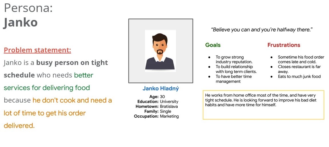
Many people nowadays don’t have time to cook and like to order food online. But food delivery can sometimes be slow and the food comes cold. Especially if you live somewhere in the suburbs. That’s why we’re developing food delivery by drone
The goal:
We are making a website to complement our food delivery app with precise on-time delivery with drones
My Role:
UX Generalist
Responsibilities:
Conducting interviews, paper and digital wireframing, low and high-fidelity prototyping, conducting usability studies, accounting for accessibility, iterating on design, determining information architecture, and responsive design.
Understanding the user
User Research
Personas
Problem Statements
User journey maps
User research: Summary
We conduct market research on whether there is a need for additional applications & website for food delivery and we came to the conclusion that people like to order food online, but the waiting time for delivery is relatively long. That’s why we decided on the concept of food delivery with drones.
User research: Pain points
Travel to the restaurant and back, every day from the suburbs to the city center is very time-consuming.
Finding a free table and waiting for the meal to be prepared.
When using online food delivery, deliveries can be delayed by traffic jams and the meal comes cold.
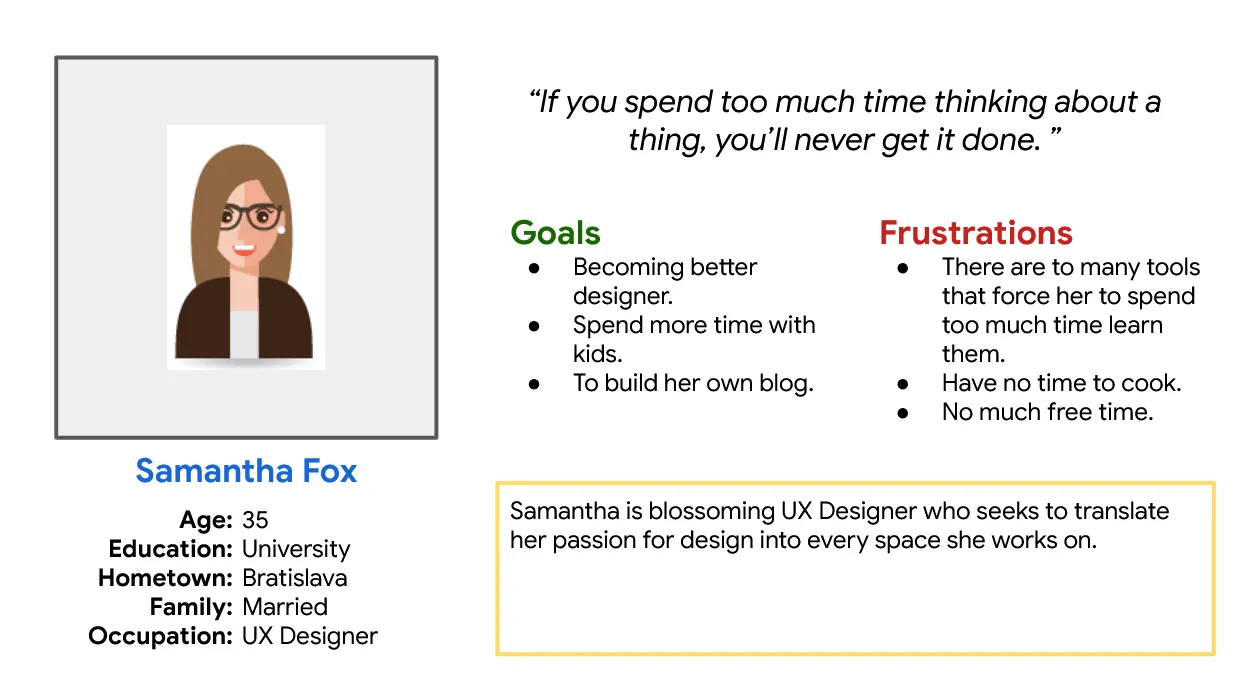
Personas
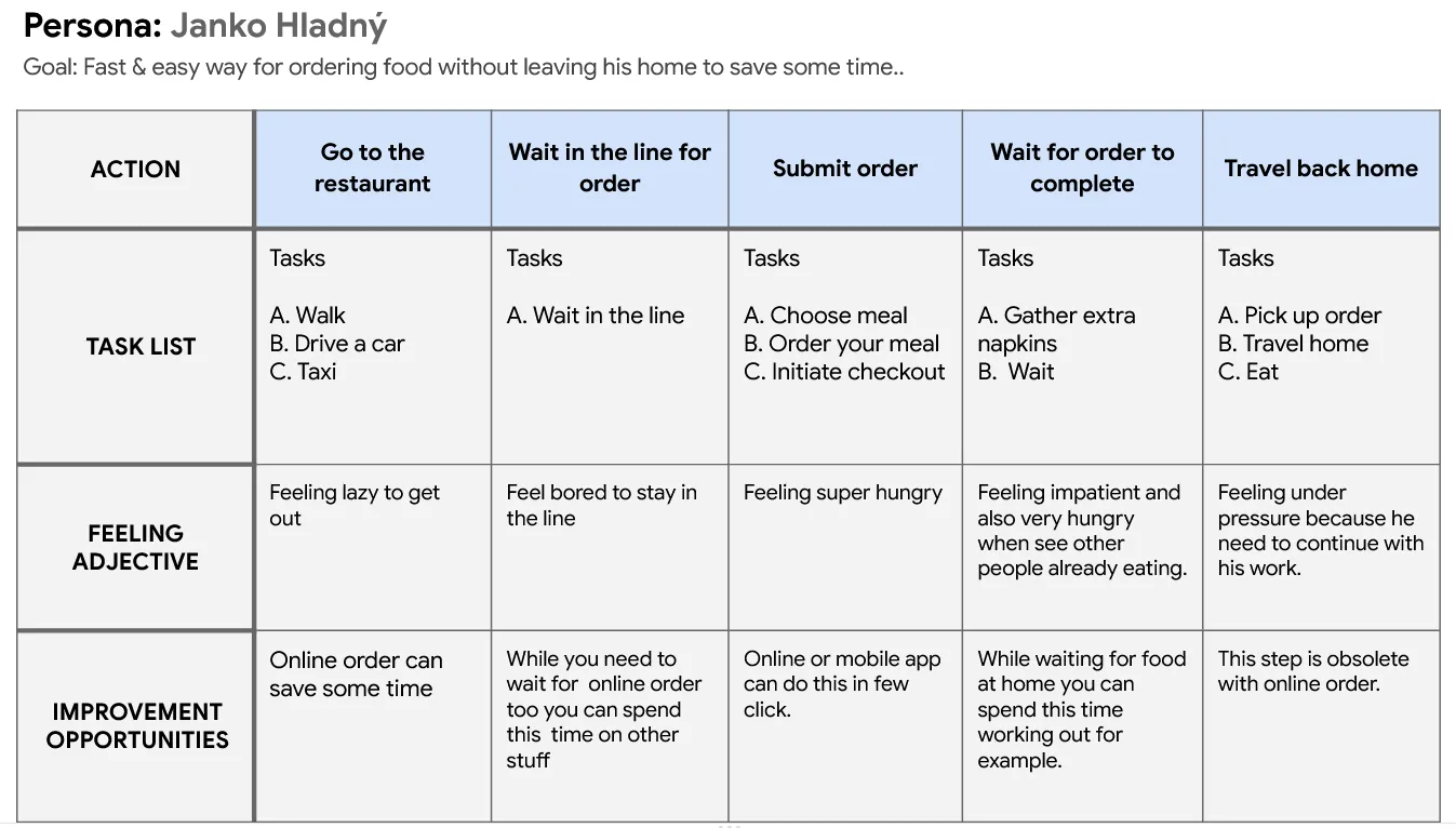
User journey map
Goal: Fast and hustle free way to order food while working from home, with reliable delivery times.
Starting the design
Information architecture
Paper wireframes
Digital wireframes
Low-fidelity prototype
Usability studies
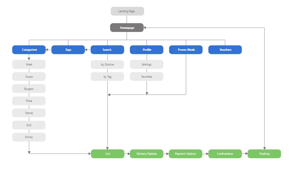
IA – Information Architecture
Wireframes
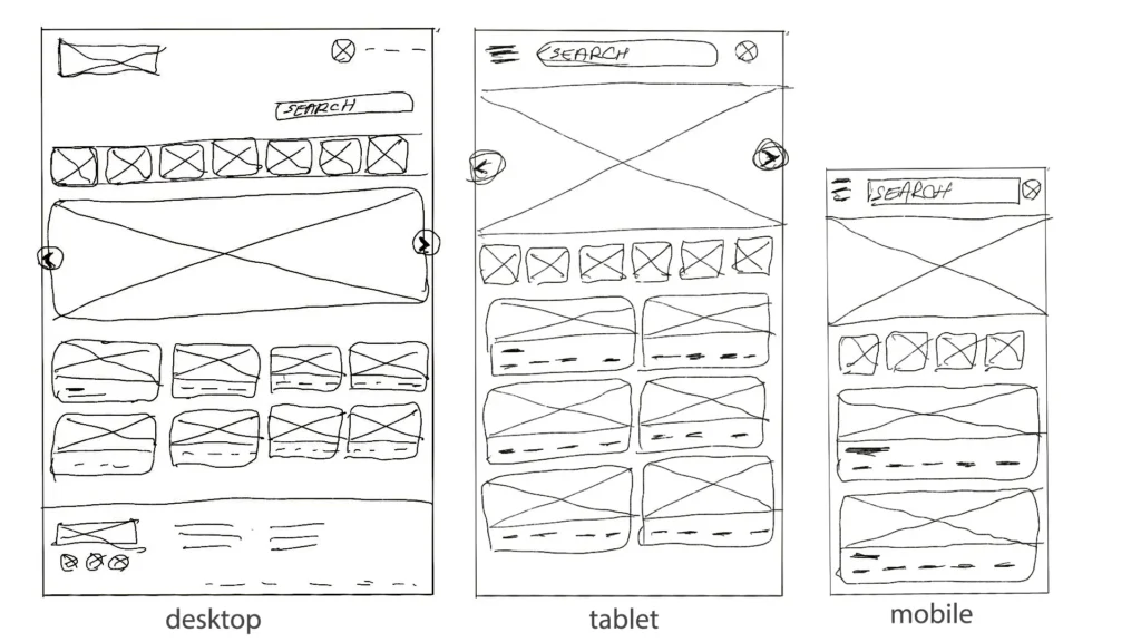
Paper Wireframe
First ideas drawn on the paper with thoughts about some basic functionality
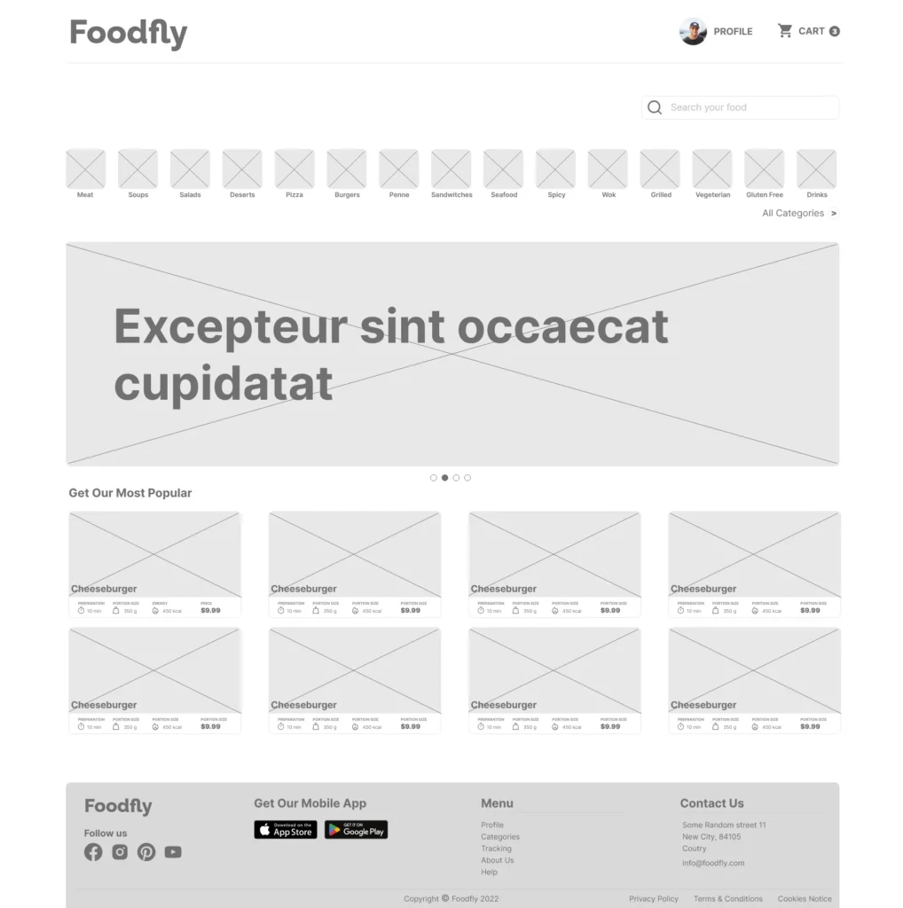
Digital wireframes
Clear and immediate familiar design, clean and simple, with lots of inviting pictures of freshly cooked meals.
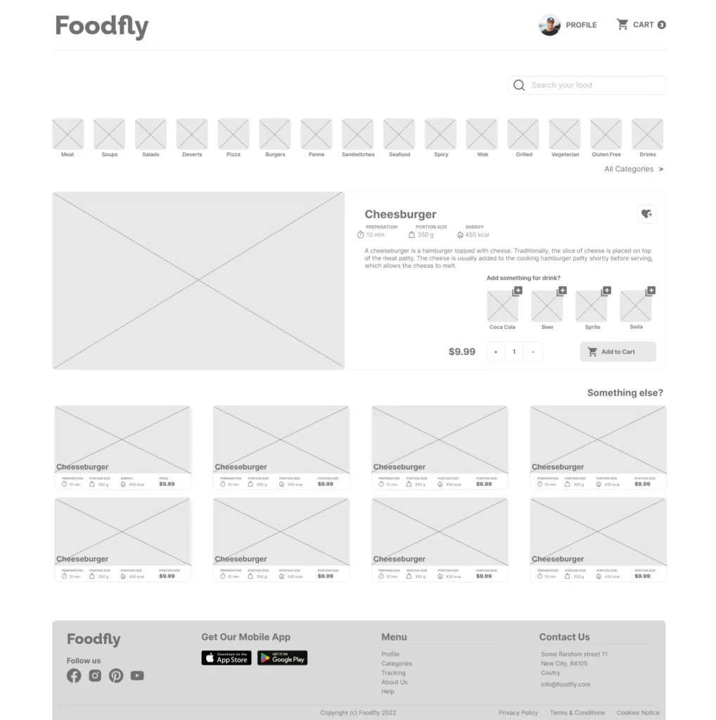
Digital wireframes
Drones have no obstacles in delivery like traffic jams, or traffic lights so order tracking can be very precise.

Usability study: findings
We want to understand the user journey for picking up food and the whole ordering process, order tracking, and completing orders on this website. Also, we want to develop a deeper understanding of how customers/users are currently using the product and identify potential pain points they may experience as they interact with the product.
Round 1 findings
- Participants found the process of ordering food simple and straightforward.
- Participants were familiar with the checkout process from similar food delivery apps and seemed pleased with how intuitive it was
- The main menu bar does not clearly show in which category you are.
Round 2 findings
- Fixed main menu showing active tab and users are ok with it.
- The participant was happy to know every step where the order, in which preparation/delivery process it is.
- Participant looking forward to use app as finished product.
Refining the design
Mockups
High-fidelity prototype
Accessibility
Mockups
We fixed some minor issues that appeared during the usability testing phase.
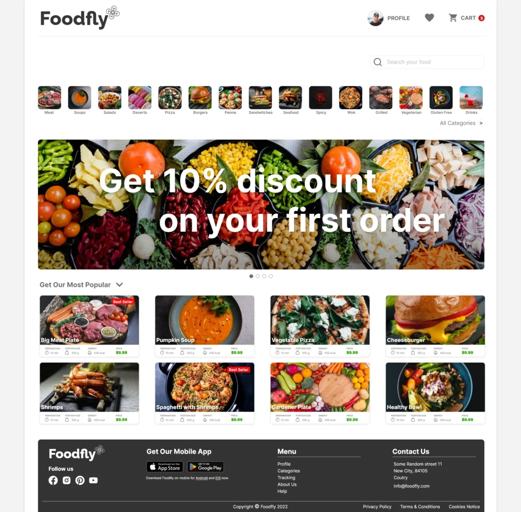
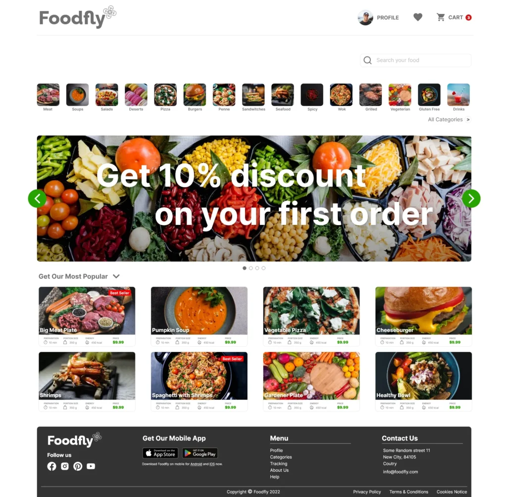
The main menu active tab was visible more clearly


High-fidelity Foodfly responsive website mockups after usability study
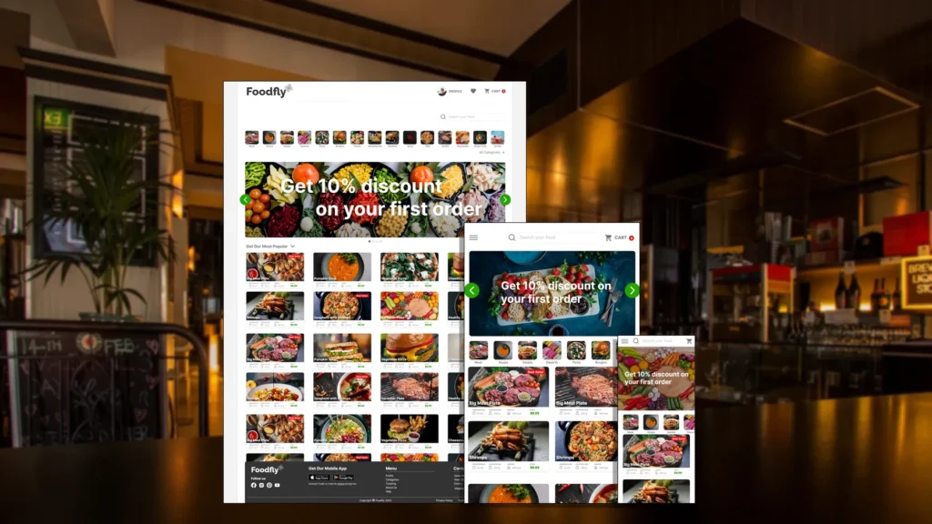
High-fidelity prototype
Accessibility considerations
The design is clean and easy to use. The space between the elements is sufficient so that the users do not struggle with buttons.
Choosing meal and whole order process is straightforward and easy to understand. All screens inform you which step coming next so users is not surprised with unusual app behavior.
Contrast on all elements is high enough for customers with visual impairment.
Going forward
Takeaways
Next steps
Takeaways
Impact:
“Really looking forward to drone delivery”.
“Can’t wait for my food being delivered by drone”.
“This app makes me hungry.”
What I learned:
This project taught me a lot. From, I didn’t know what to expect, to be able to empathize with users, get inside from research, creating visual design for the whole app based on user needs and feedback. Complete the ux/ui process from start to finish. It was quite a journey. Thank you.
Next steps
Working on further improvements.
Add feature, for more restaurants food menu offer with this app not just one.
Fixing pain points from user feedback when the website goes live.
Let’s connect!
Thank you for your time reviewing my work on the Foodfly – Food delivery with drones website. If you like to see more or would like to get in touch, don’t hesitate to contact me.