Jobsi
Job board for fresh graduates
UX Case Study
Project Overview
The product:
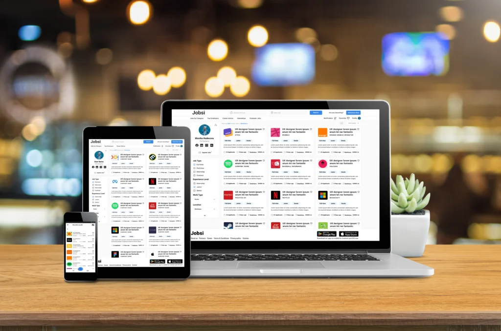
This was my third project as part of Google UX design professional certificate. Task was to design for cross-platform app for community good. My desision was to create platform to help young graduates to find job more easily. So, I need to design dedicated mobile app and responsive website to fit all screen sizes.
Project duration:
October 2022 to December 2022
The problem:
30% of fresh graduates in Slovakia have problems finding a job because Employers prefer 1 or more years of experience in the field before you get the job.
My Role:
Lead UX designer, UX researcher
The goal:
Design a cross-platform job board to help fresh graduates to find job more easily.
Responsibilities:
Conducting interviews, paper and digital wireframing, low and high-fidelity prototyping, conducting usability studies, accounting for accessibility, iterating on design, determining information architecture, and responsive design.
Understanding the user
User Research
Personas
Problem Statements
User research: Summary
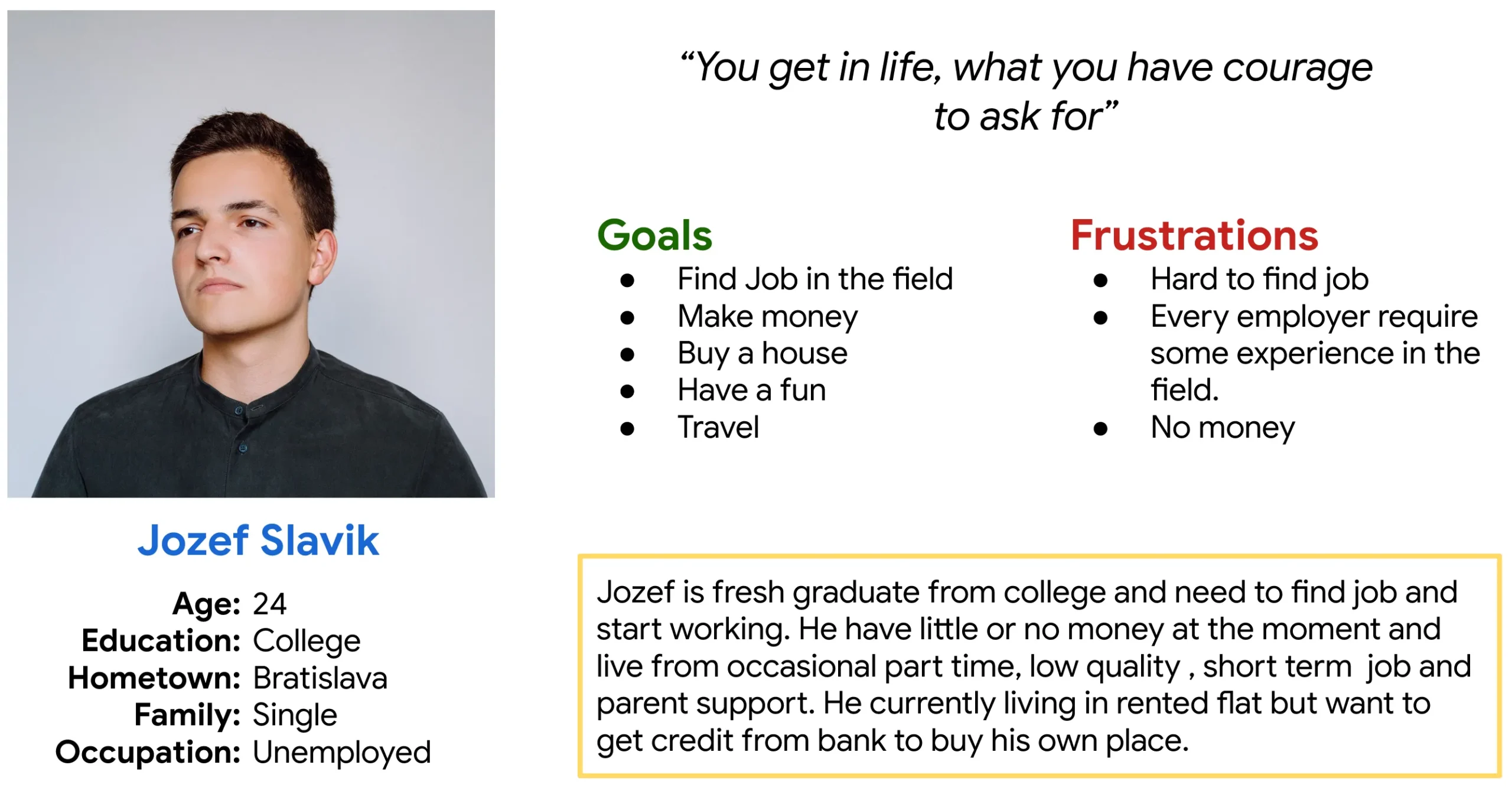
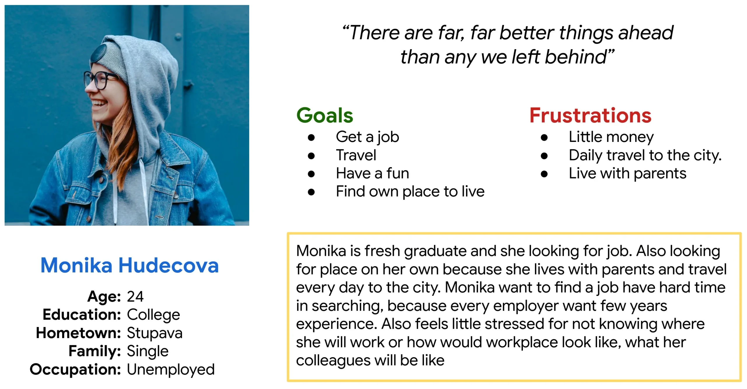
We used online research and social network discussions to develop questions when we conduct fresh graduates interviews. Most graduates reported that they facing problem with employers asking for few years of experience for particular job position. Also many of young grads have fear of unknown. How they new workplace, company, colleagues will look like or similar. Feedback that we received through research made it very clear young people will gladly have platform on which employers doesn’t necessarily ask for experience.
Pain points
Work experience
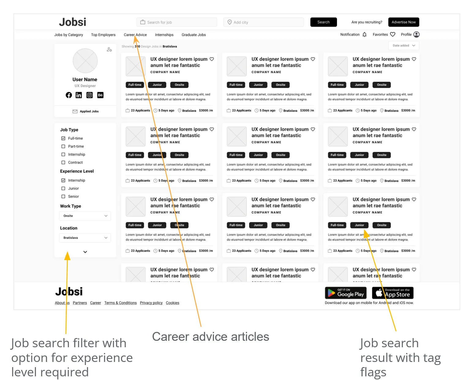
We will implement a search filter for internships, junior positions, and positions that don’t require job experience.
Fear of unknown
On company profiles, we will provide info about the company. Image gallery of company workspaces, employers, etc.
Self promotion
We will offer career advice article on weekly basis to educate grads more how they can be more successful in job finding.
Personas
Starting the design
Sitemap
Paper wireframes
Digital wireframes
Low-fidelity prototype
Usability studies
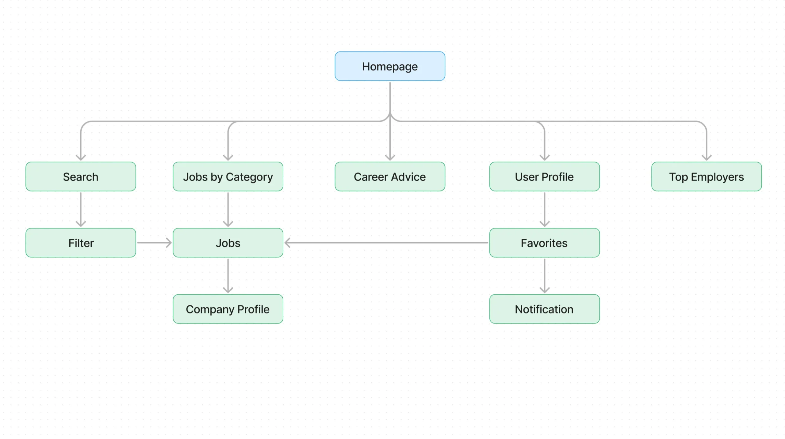
Sitemap
Paper Wireframe
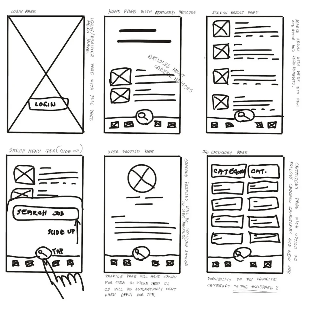
First ideas drawn on the paper with thoughts about some basic functionality
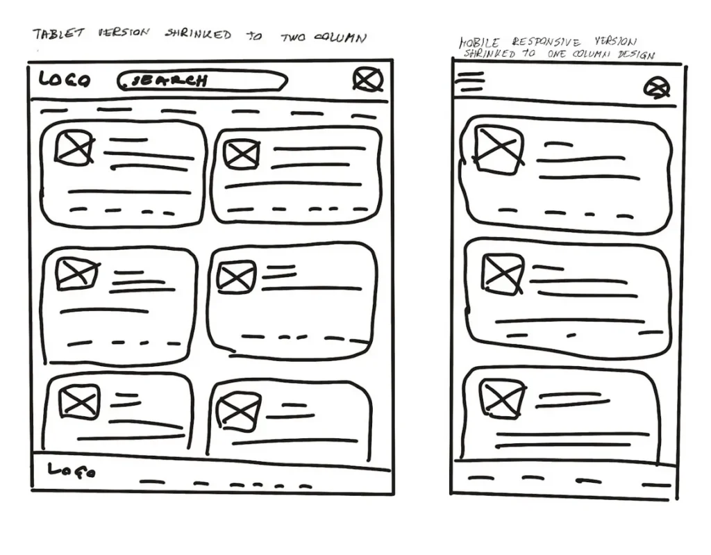
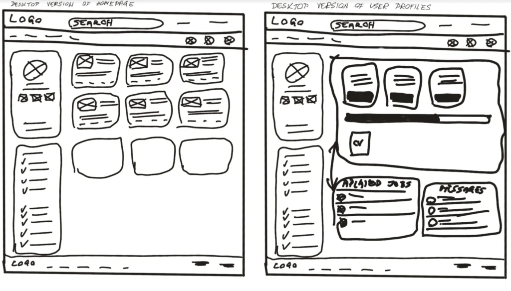
Paper wireframe screen size variation(s)
First drawing of responsive desktop versions and how they shrinks based on screen size. Desktop, tablet & mobile.
Digital wireframes
Users can filter jobs by experience levels. Also there is section for career advices to potentially be more successful in getting hired.
Digital wireframe screen size variation(s)
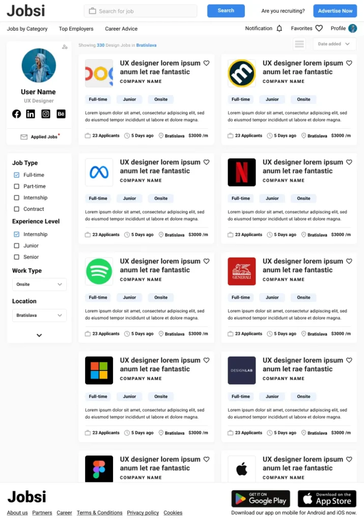
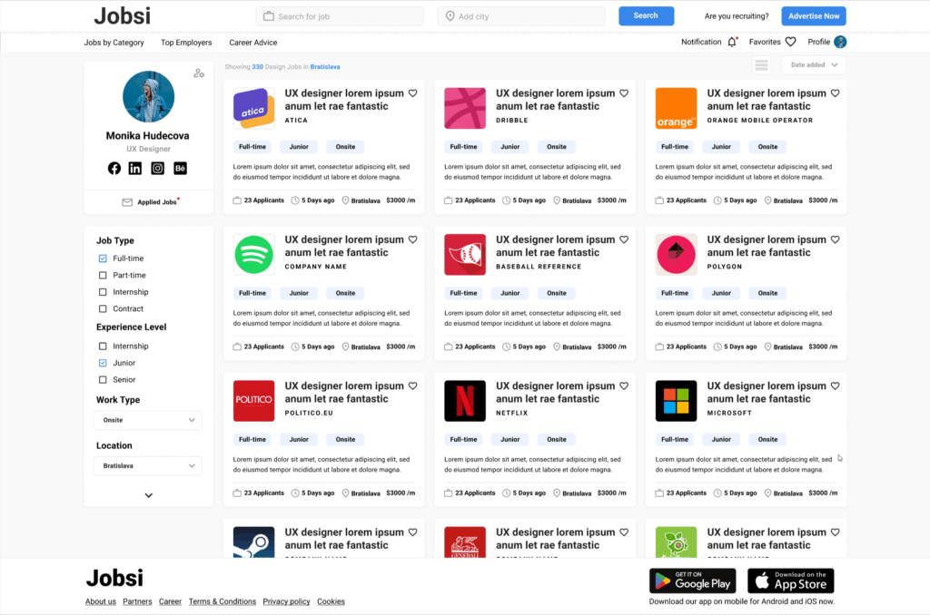
Jobsi website is fully responsive design across all devices and screens sizes.
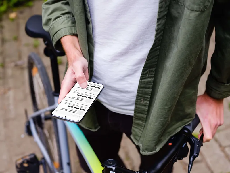
Digital mockup wireframe – mobile
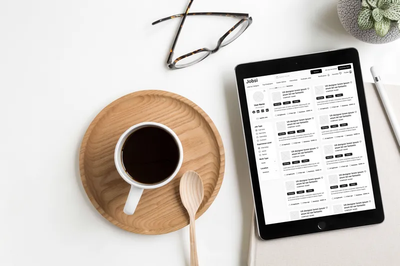
Digital mockup wireframe – tablet
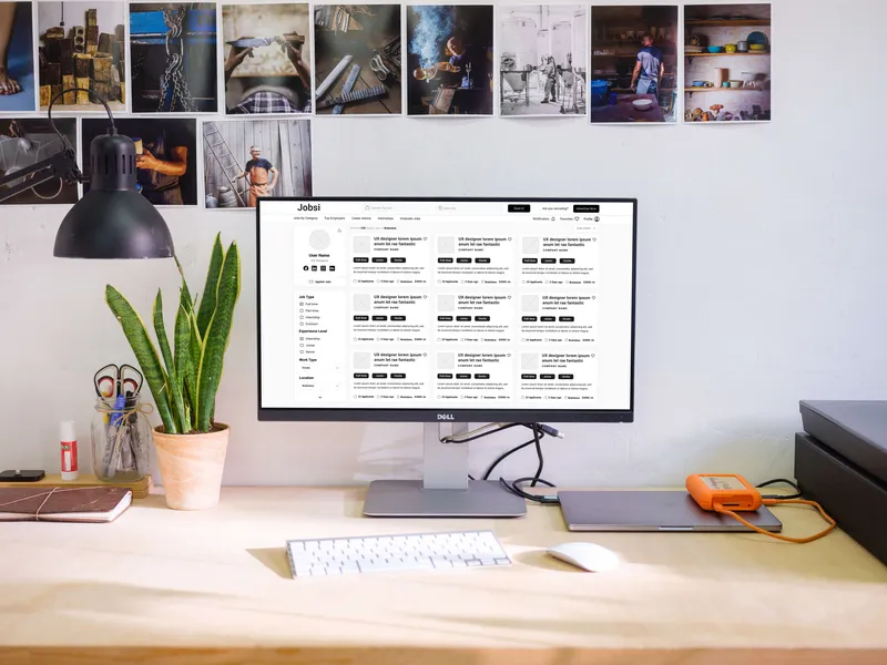
Digital mockup wireframe – desktop
Low fidelity prototype
Mobile app low fidelity prototype
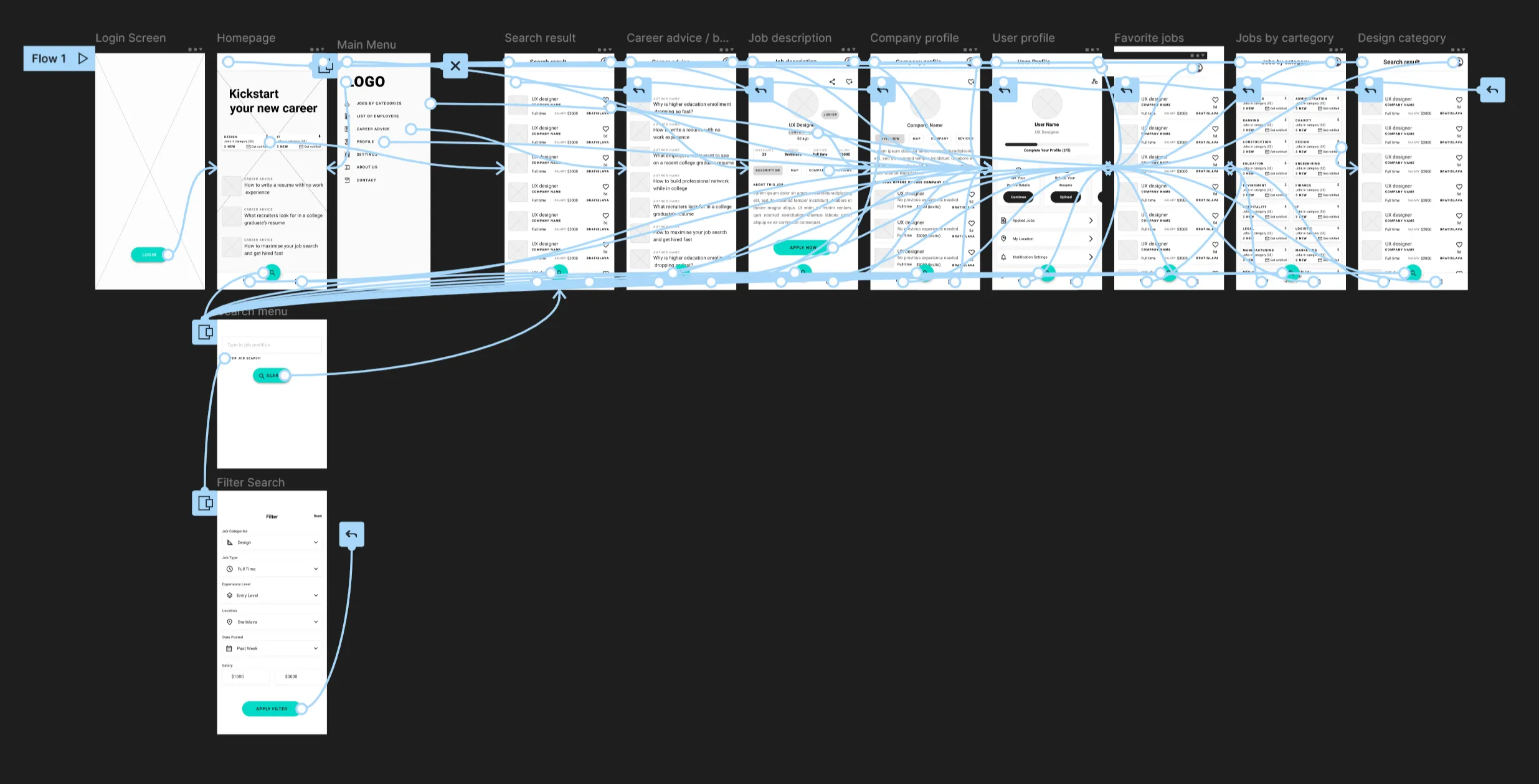
Website prototype
Website low fidelity prototype

Usability study: Parameters
Study type:
Unmoderated usability study
Location:
Slovakia, remote
Participants:
5 participants
Length:
20 min
Usability study: Findings
High fidelity Website usability study resulted in a few interesting findings
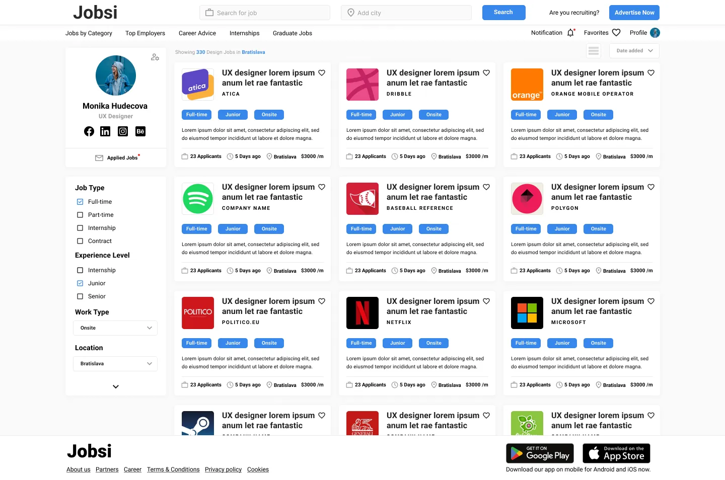
On the desktop version of the homepage, participants found jobs tags looked similar to buttons and that was too confusing and cluttered.
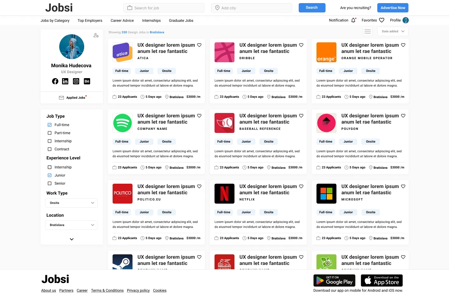
The desktop version should have a possibility to switch view from card to line which users find more easy to browse thru job offers
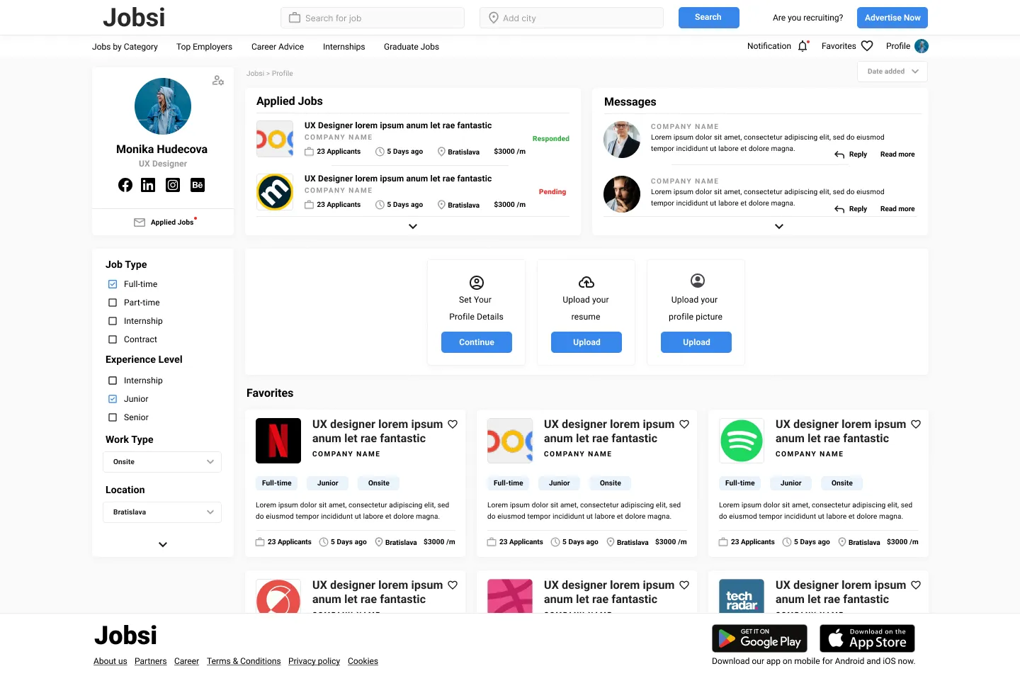
Desktop & mobile versions should have more personal info visible to the user. Also add a possibility to fill up a form like a resume.
Refining the design
Mockups
High-fidelity prototype
Accessibility
Mockups
Finding no.1
Users find jobs tags look similar to buttons and that was too confusing and cluttered.

Finding no.2
Participants want to have option to switch views from cards to list, so we implemented another two. Medium list & small list view.

Finding no.3
Desktop & mobile version should have more personal info visible to user. Visible what’s added what not. Also add possibility to fill up form like resume, not just upload pdf.

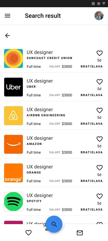
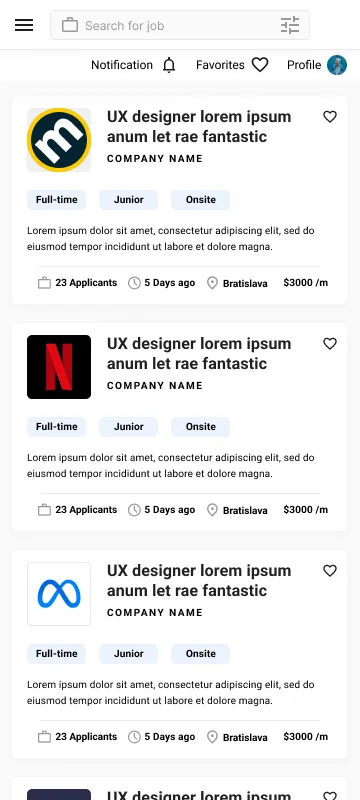
Mockups : original screen sizes
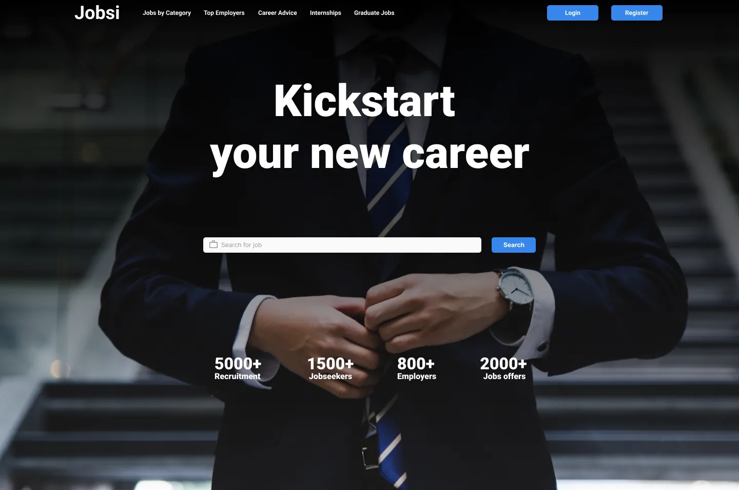

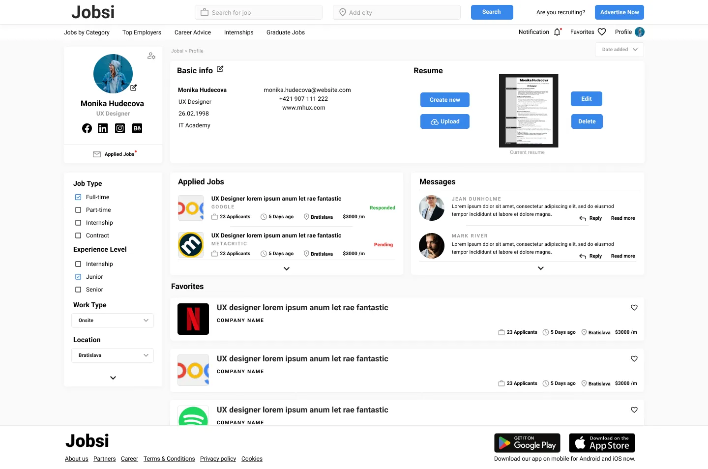
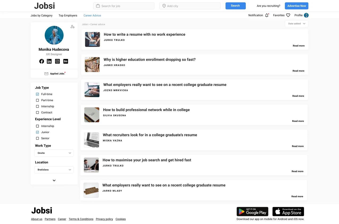
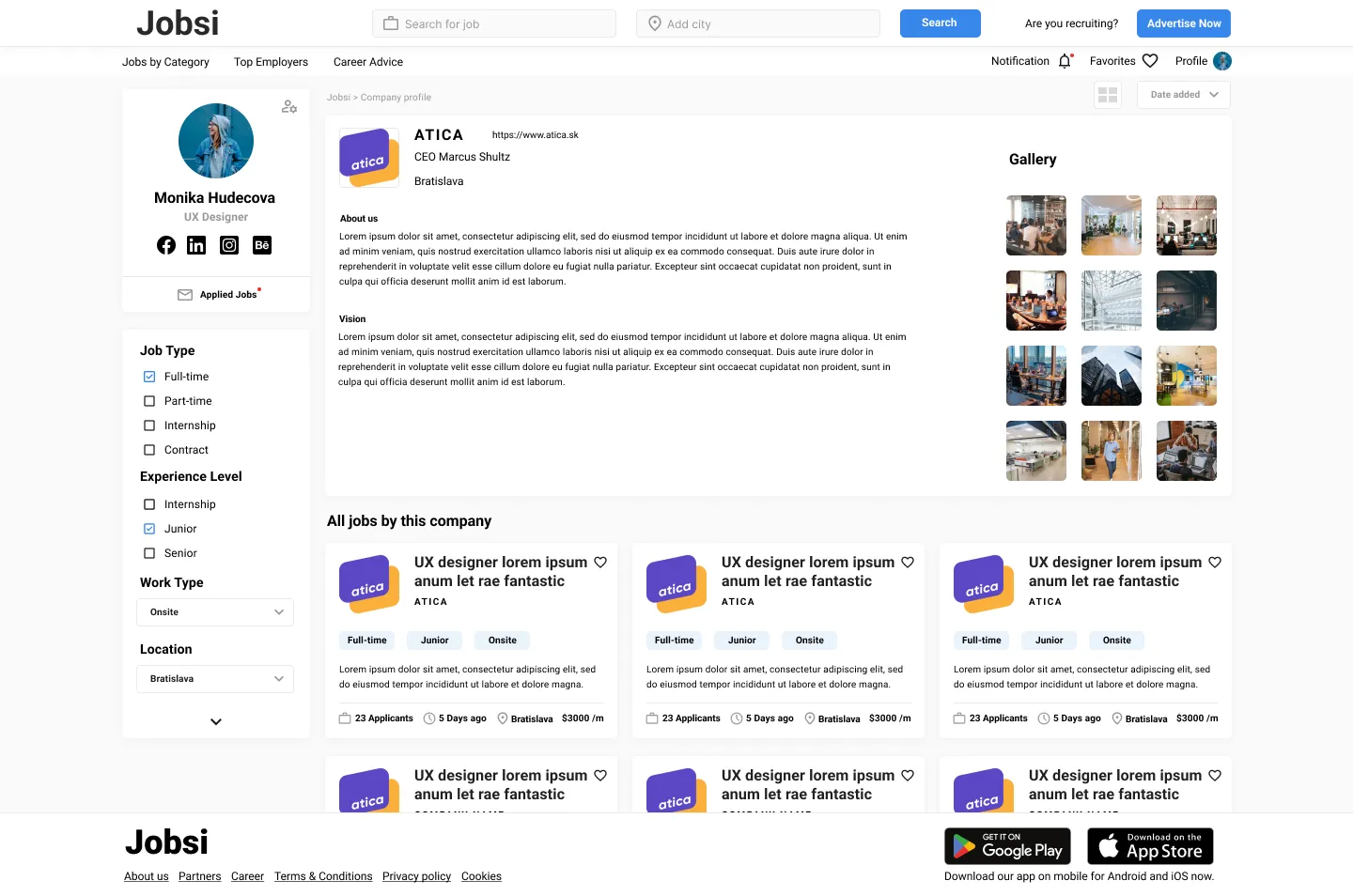
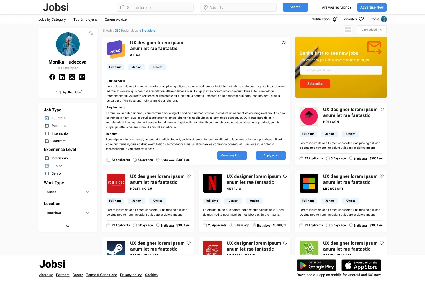

Mockups: Screen size variations
High-fidelity prototype

Dedicated mobile app high-fidelity prototype:
Website high-fidelity prototype:
Accessibility considerations
Clear labels for interactive elements that can be read by screen readers.
More focus on homepage of desktop design for more personalized recommendation for users to find job even more easier
Going forward
Takeaways
Next steps
Takeaways
Impact:
People who have seen and tested the Jobs platform seem to like the project and think that it could help grads find jobs more easily.
What I learned:
This project taught me that even if at the beginning something seems complicated and I think I can’t handle it, going through each step of the UX design process gradually and meeting the needs of the users, we always find a solution to the problem.
Next steps
Conduct research on how successful app is in reaching the goal to grads find a job.
Add even more educational resources for users to successfully find a job.
Create an online resume creation tool with templates.
Let’s connect!
Thank you for your time reviewing my work on the Jobsi – Job Board app! If you like to see more or would like to get in touch, don’t hesitate to contact me.